|
The Top 3 Photographic
Composition Tips
By Dan Davenport
Here are the three top tips for placing a subject, or objects, in the viewfinder of the camera so that it comes out just right.
Tip #1 ... "The Rule of Thirds"
 Just imagine that your viewfinder is divided by two evenly spaced horizontal lines and two evenly spaced vertical lines - very much like a Tic-Tac-Toe (or Noughts and Crosses) board. These lines, and where they intersect, are great places for important elements of your picture. Just imagine that your viewfinder is divided by two evenly spaced horizontal lines and two evenly spaced vertical lines - very much like a Tic-Tac-Toe (or Noughts and Crosses) board. These lines, and where they intersect, are great places for important elements of your picture.
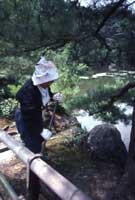
 You can see where the rule of thirds has been applied in this photo. The important element of the photo is on one of the lines or intersections, and you can easily move your camera and yourself around until you have a perfectly composed picture. You can see where the rule of thirds has been applied in this photo. The important element of the photo is on one of the lines or intersections, and you can easily move your camera and yourself around until you have a perfectly composed picture.
There are also other areas where the rule of thirds can help make our pictures more interesting and appealing. In a picture where you have a horizon, or other horizontal line, you could place it in the center of the picture. You then wind up with two very static, quiet compositions... The top one, and the bottom one. This is not necessarily bad ... If this is the picture you want, restful, undemanding, then that's OK. But, on the other hand, if you want a more dynamic picture ... remember The Rule of Thirds.
Just place the horizon, the stage, the line, the place where the sand meets the sea, on either the lower third or the upper third of your frame and shoot.
 If the upper part of the frame seems to be boring then just let it occupy less of the picture (Beach at Martha's Vineyard, Massachussets - Gay Head in the background. Try staying at
Martha's Vineyard Resort). If the upper part of the frame seems to be boring then just let it occupy less of the picture (Beach at Martha's Vineyard, Massachussets - Gay Head in the background. Try staying at
Martha's Vineyard Resort).
 If the lower part of the frame seems uninteresting, or you want to get as much of that beautiful cloud formation (in this case, fog rolling in over The Golden Gate Bridge in San Francisco - taken from Coit Tower) as possible, then let the bottom part of the picture be as little as possible. If the lower part of the frame seems uninteresting, or you want to get as much of that beautiful cloud formation (in this case, fog rolling in over The Golden Gate Bridge in San Francisco - taken from Coit Tower) as possible, then let the bottom part of the picture be as little as possible.
Tip #2 ... When your subject is not looking directly at the camera, frame your picture with your subject looking into the picture, not out of the picture.
Where the subject is looking will also draw your viewer's attention, and you can bet they will wonder what's going on out there, and why you didn't show it.
 But, when you compose with your subject looking or moving into the frame, your picture will contain the entire statement, and will not refer your viewer to something out of the frame. But, when you compose with your subject looking or moving into the frame, your picture will contain the entire statement, and will not refer your viewer to something out of the frame.
Tip #3 ... The viewfinder is the place to compose you photos, not on your computer later, so be aware of the picture when you are looking at through the camera. The more carefully you compose your picture when you are looking through the viewfinder, the less work you will have to do later to get just the picture you were looking for.
That's it, the top three photographic composition tips guaranteed to give you great photos that will look great hanging on your wall, and you, your family, and your friends will enjoy viewing them for years to come.
And speaking of proudly displaying your great new photos on the wall, here are some great offers from our partners to get you going:


And talk about unique.... our partner Cafe Press has been, for years, one of the great places to get your photos and ideas onto tee shirts, mugs, calendars - all sorts of stuff. Check it out!!!


Dan Davenport has been involved in photography for more years than he cares to think about. He worked for Minolta Cameras for over 30 years and taught photography as well as developing the Minolta School of Photography which evolved into The Maxxum Experience photo education seminars. He wants photographers to take the best photos they can and encourages them to proudly display their work for all to see.
© 2010 Dan Davenport


|

